
Inplant — Civil Engineering & Infrastructure Planning
The first professionals to appear on an infrastructure project, standing out is not a distant goal, it’s a daily reality. Ensuring nothing goes off track and that the project is followed on-site, while implementing the best service and making life easier for countless people, is at the core of what this brand represents.
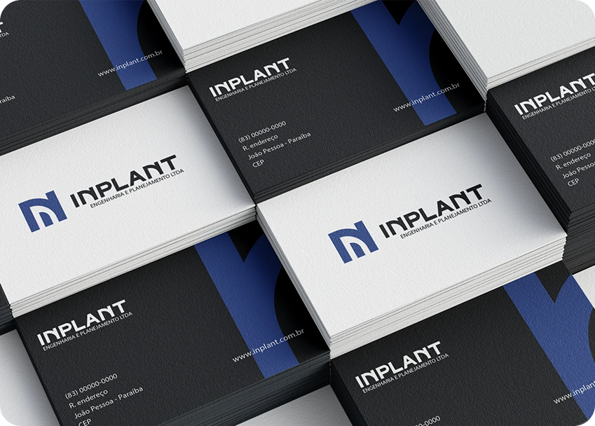
The identity translates that responsibility into a visual system: modern, iconic, and built on a sans-serif typography with strong structural power and elegance. Graphic compositions tied to the brand’s blue convey a sense of tranquility, while still maintaining elegance and commitment resulting in trust.
- Scope
- Brand Identity
- Creative Strategy
- Role
- Visual Designer
- Brand Strategist
- Art Director
- Tools
- Adobe Creative Suite
- Figma

Strategy & Positioning
The company positions itself as being present from the very first stage of a project, the first professionals on-site, carrying the responsibility of keeping every phase aligned and on track.
The brand strategy centered on three pillars:
- Precision: a visual system with clear structure and no unnecessary ornamentation.
- Trust: a calming, consistent clear language that signals reliability over time.
- Elegance with commitment: a tone that feels premium and considered, not purely technical or cold.

The Challenge
Infrastructure and civil engineering brands often default to generic corporate visuals: blueprints, hard hats, cranes that fail to communicate the precision, trust, and long-term responsibility the work actually demands. The challenge was to build an identity that felt structurally confident, reflecting engineering rigor itself, while remaining approachable enough to represent a company whose work directly touches people’s daily lives.
How do you design a brand that feels as reliable and load-bearing as the infrastructure it plans?
A sans-serif typeface was chosen as the foundation of the identity for its structural power, clean, geometric letterforms that echo the precision of engineering drafting, paired with enough refinement to keep the brand elegant rather than purely utilitarian.
The brand’s core blue was selected specifically to convey tranquility and steadiness, grounding the identity in a color associated with dependability and clear thinking, while graphic compositions built around it reinforce a tone of elegance and commitment, ultimately translating into a sense of trust.
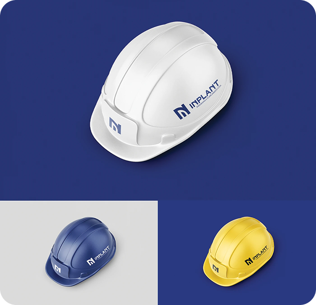
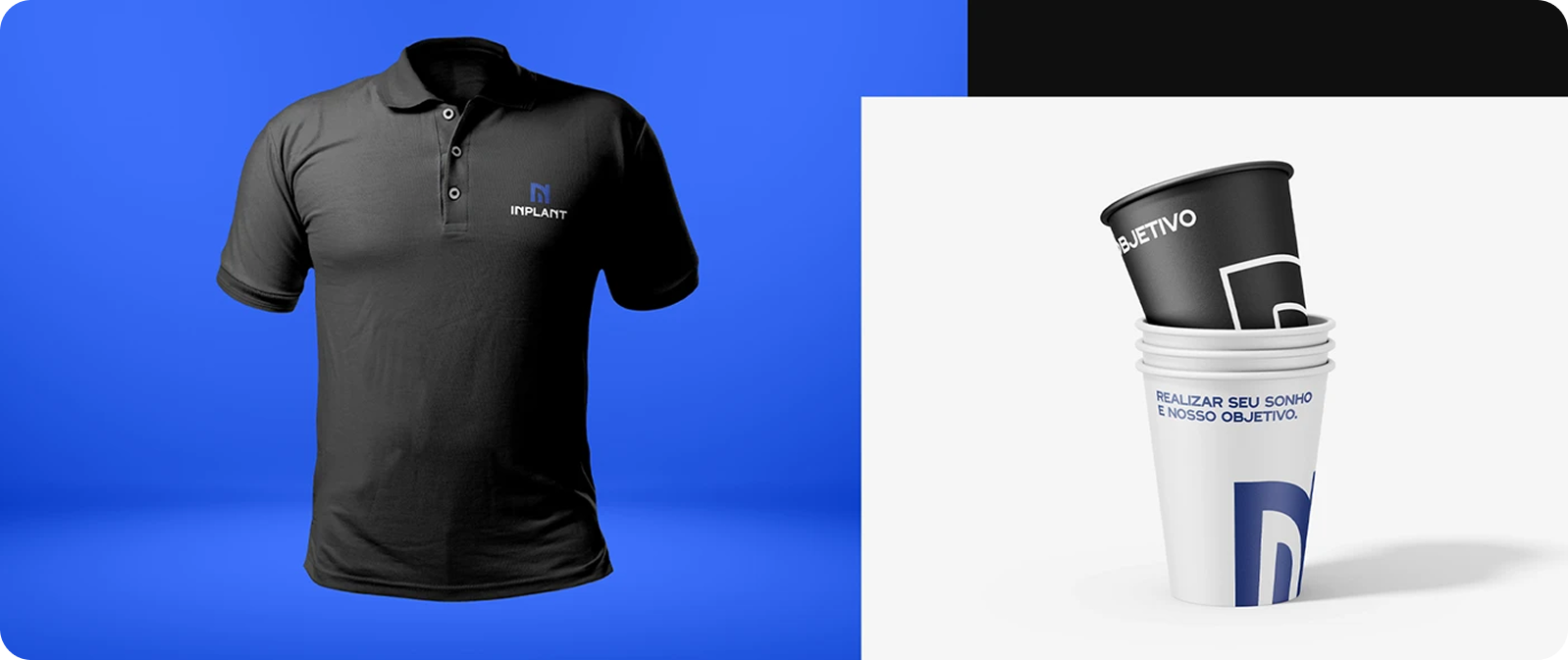
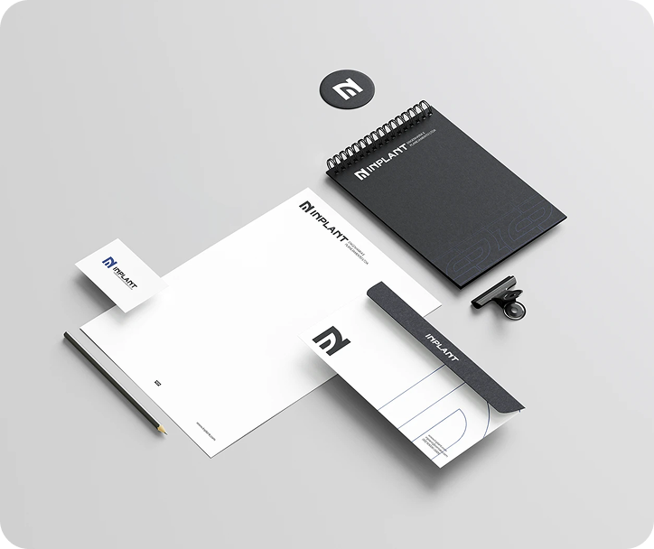
The mark was developed for strong, standalone recognition: an icon designed to work at a glance across signage, uniforms, vehicles, and documentation, reinforcing the brand’s presence as the first, consistent signal on any project site.



Check the full project on Behance